The redesigned identity of ADS & NSD Partners Group marks a new stage in the group’s evolution. Built on the foundations of its historical visual language, it introduces a more contemporary, connected, and international expression of the brand.
This evolution reflects the group’s ambition to reinforce its presence across global markets while preserving the structural rigor and institutional credibility that have shaped its identity from the beginning.
The visual legacy
The historical rootsof ADS & NSD
The group’s original identity was based on precise geometry, highlighting the technical foundations of ADS & NSD Partners Group. This logo accompanied the consortium’s early formative stages, emphasizing the stability and verticality of its expertise.
Although it fulfilled its role as an institutional foundation, this visual signature has given way to a more interconnected identity, capable of supporting the group’s new strategic ambitions on a global scale.
Graphic redesign
Steps for creating the symbol
Step 1:
The new symbol reinterprets the historic triangle from the ADS & NSD Partners Group logo. As the quintessential architectural shape, this triangle is retained for its symbolism of stability and durability. Its corners are subtly rounded to give the brand a more modern, fluid, and dynamic aesthetic.
Step 2:
The structure is based on the interweaving of three triangles, illustrating the group’s fundamental pillars: Action – Development – Support. This geometric composition symbolizes the power of the network and the absolute cohesion of the consortium.
Final Step:
The addition of a backline brings depth and movement to the overall design. This element embodies the concept of a network, representing the interconnection of experts and strategic partners that make up the global ecosystem of ADS & NSD.
The symbol is therefore not a decorative mark, but a strategic construction. Each element contributes to expressing the group’s core values: stability, cohesion, expertise, and international interconnection.
Its geometric language creates a clear link between the group’s historical foundations and its future-oriented vision.
The final logo for ADS & NSD Partners Group embodies this heritage and transformation. More than just a visual evolution, it serves as the emblem of a united, agile, and forward-looking group. The power of the symbol, combined with a clean typography, reinforces our position as a leader in the management of complex international projects.
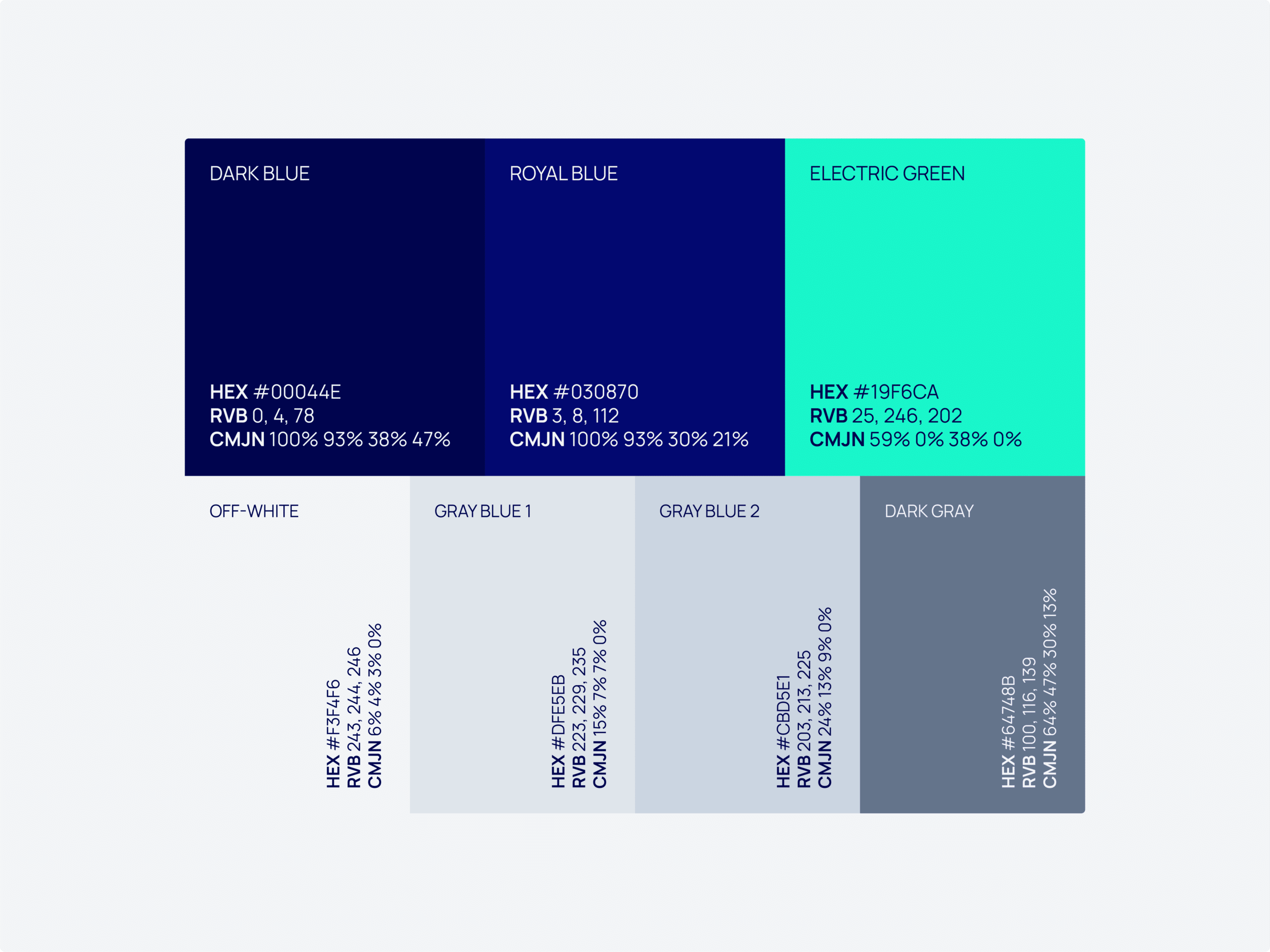
Color palette
The corporate chromatic universe
The color palette defines the visual universe of ADS & NSD Partners Group and reflects the strategic ambitions of the organization.
The Primary Duotone:
The alliance of two deep blues (Dark Blue and Royal Blue) establishes an immediate atmosphere of trust, security, and institutional authority. This chromatic foundation anchors the brand in the corporate and financial world.
The Strategic Accent:
Used for punctuation, the Electric Green embodies the technological signature of the consortium. It symbolizes continuous innovation and an unyielding commitment toward sustainability and corporate social responsibility (CSR).
The Structural Nuances:
The entire identity is structured by subtle shades of off-white and mineral grays (Off-White, Gray Blue, Dark Gray). These tones provide the necessary brightness and contrast for a modern, clean, and premium reading experience across all digital and print mediums.
Through this new visual identity, ADS & NSD Partners Group affirms a clearer and more contemporary brand platform. The logo, colors, and graphic principles work together to express a group that is structured, reliable, innovative, and fully prepared to support complex projects on an international scale.